Gallery
apps/www/src/sections/Gallery.astro · 37 lines · group Gallery & files
Gallery — pictures with captions in a grid (<GalleryItem>): team photos, certificates, product shots, references. Use for: a set of pictures that each need a caption, optionally linking somewhere. Not for: a decorative photo band (<BannerImage>); files without pictures (<Downloads>). Children: <GalleryItem> tags. Layout: `columns` 2–4 (default 3).
In the fleet
Used on 1 site built with this engine.
Samples 2
Where the stations stand
Orchards, greenhouses and open fields, in the season they were photographed.

In the orchard

Under glass

Open field
MDX of this sample
<Gallery title="Where the stations stand" description="Orchards, greenhouses and open fields, in the season they were photographed.">
  <GalleryItem title="In the orchard" image="photo-01.jpg" photo />
  <GalleryItem title="Under glass" image="photo-02.jpg" photo />
  <GalleryItem title="Open field" image="photo-03.jpg" photo />
</Gallery>What is in the box

Station N3
Sealed housing, one bolt.
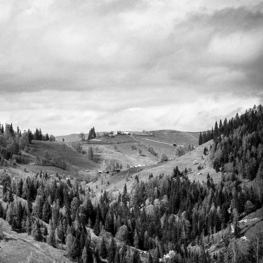
Gateway G2
Four kilometres of range.
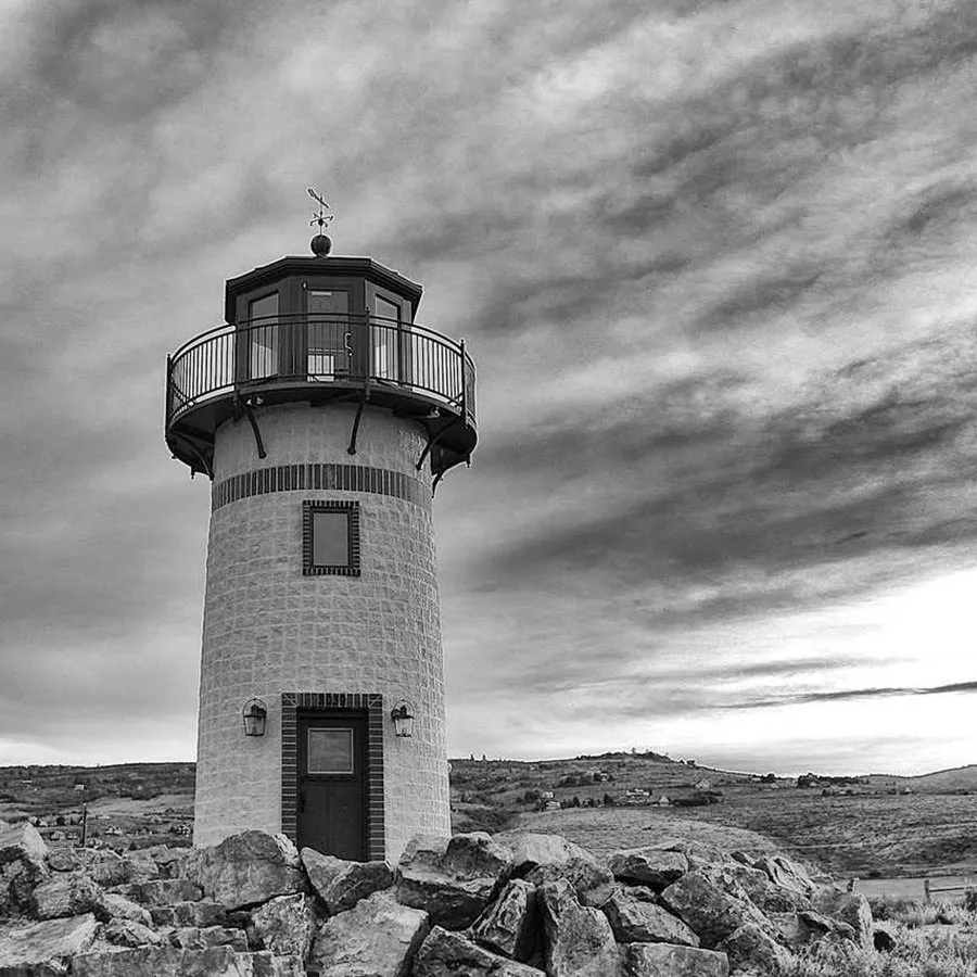
Spare sensor
Swaps by hand.

Dashboard
The same view on every device.
MDX of this sample
<Gallery title="What is in the box" columns={4}>
  <GalleryItem title="Station N3" image="product-01.jpg" description="Sealed housing, one bolt." />
  <GalleryItem title="Gateway G2" image="product-02.jpg" description="Four kilometres of range." />
  <GalleryItem title="Spare sensor" image="product-03.jpg" description="Swaps by hand." />
  <GalleryItem title="Dashboard" image="screen-01.png" description="The same view on every device." href="/dashboard/" />
</Gallery>
Props
| Name | Type | Required | Default | Description |
|---|---|---|---|---|
| id | string | anchor of the section | ||
| title | string | the section heading | ||
| description | string | a paragraph under the heading | ||
| columns | 2 | 3 | 4 | 3 | pictures per row on desktop | |
| theme | 'light' | 'muted' | 'dark' | 'brand' | 'brand-dark' | 'light' | background of the section |
Source apps/www/src/sections/Gallery.astro @ gitt.one
---
/**
 * Gallery — pictures with captions in a grid (<GalleryItem>): team photos,
 *   certificates, product shots, references.
 *
 * Use for: a set of pictures that each need a caption, optionally linking
 *   somewhere.
 * Not for: a decorative photo band (<BannerImage>); files without pictures
 *   (<Downloads>).
 * Children: <GalleryItem> tags.
 * Layout: `columns` 2–4 (default 3).
 */
import Section from './_Section.astro';
import type { Theme } from './_Section.astro';

interface Props {
  /** anchor of the section */
  id?: string;
  /** the section heading */
  title?: string;
  /** a paragraph under the heading */
  description?: string;
  /** pictures per row on desktop */
  columns?: 2 | 3 | 4;
  /** background of the section */
  theme?: Theme;
}
const { id, title, description, columns = 3, theme = 'light' } = Astro.props;
const cols = { 2: 'sm:grid-cols-2', 3: 'sm:grid-cols-2 lg:grid-cols-3', 4: 'sm:grid-cols-2 lg:grid-cols-4' }[columns];
---

<Section id={id} title={title} description={description} theme={theme}>
  <ul class:list={['grid list-none grid-cols-1 gap-8', cols]} data-variant="cards">
    <slot />
  </ul>
</Section>
Source links point to engine-astro@7b686388. Samples are demo content: the components are the real ones, the copy and the pictures are made up.