HeroCoverpopularsections/HeroCover.astroon 3 sites of the fleet
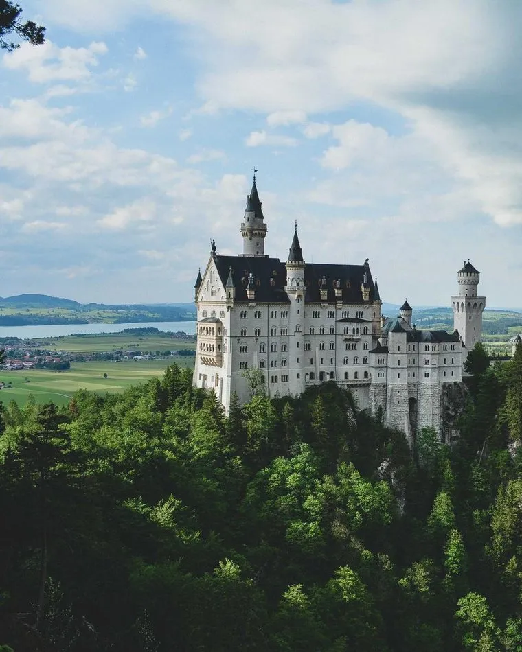
HeroCover — the first screen: a full-width photo under the brand gradient, the title, pitch and buttons centered on top of it. Use for: a landing that opens with a wide, atmospheric photo (a landscape, a workplace, a team) and one short promise. Not for: a product shot that must stay whole (<HeroSplit imageFit="contain">); a page that opens with words alone (<HeroText>). Children: optional markdown between the tags, rendered under the description and above the buttons. No sub-block tags. Picture: LANDSCAPE. It is cropped to fill the section and tinted with the brand colour, so it must not carry text or a logo. Without `image` the section is a plain brand-coloured band. Follow-up: by default the bottom keeps room for a <FeatureCards overlap> row that hangs over the edge. Set overlapNext={false} when the next section is anything else, or the hero ends with an empty band. Buttons: a button appears only when its text is given; primary is the solid brand button, secondary the translucent one.

Weather that pays offin the field, not on a grid cell
A station you install in an hour and forget about for a season. Frost, wind and leaf wetness measured inside the crop, not at the airport twenty kilometres away.
HeroSplitpopularsections/HeroSplit.astroon 3 sites of the fleet
HeroSplit — the first screen with the text on one side and the picture on the other. Use for: a product with a picture worth half the screen — a device, a packshot, a screenshot. Not for: a wide photo as a backdrop (<HeroCover>); no picture at all (<HeroText>). Children: optional markdown between the tags, rendered under the description and above the buttons. No sub-block tags. Picture: `imageFit` decides how it looks. imageFit="contain" (default) shows the picture whole, hugging the bottom edge of its half. Only a PORTRAIT or square picture looks right; a landscape one sinks into the bottom corner and leaves the top of its half empty. Product shots on a transparent or white background work best. imageFit="cover" fills the picture half edge to edge, cropped, with a diagonal that hands the text band over to the photo. Use it for a LANDSCAPE photo. Theme: "light" (white) or "dark" (stone band with white text). imageSide puts the picture left or right. Buttons: a button appears only when its text is given.
Nordvind Station N3Two-year battery, one bolt
Sensors come calibrated and swap in the field without tools. The housing survives the winter outdoors, and the radio reaches the gateway from four kilometres away.
HeroTextsections/HeroText.astro
HeroText — the first screen without a picture: title, pitch and buttons, centered in a reading column. Use for: a page that opens with words alone — a service, a consultancy, a documentation landing, an inner page. Not for: a page that has a good picture — use <HeroSplit> or <HeroCover>; a mid-page call to action — use a <Cta…> section, this one renders an <h1>. Children: optional markdown between the tags, rendered under the description and above the buttons. No sub-block tags. Theme: "light" (white) or "dark" (stone band with white text). Buttons: a button appears only when its text is given.
Frost alerts that arrive in timenot a forecast — a measurement
Set a threshold once and the alert finds you by SMS, e-mail or in the app, early enough to start the fans.
Source links point to engine-astro@7b686388. Samples are demo content: the components are the real ones, the copy and the pictures are made up.