HeroSplitpopular
apps/www/src/sections/HeroSplit.astro · 77 lines · group Hero
HeroSplit — the first screen with the text on one side and the picture on the other. `imageSide` puts the picture left or right; `theme="dark"` sets the text on a stone band. imageFit="contain" shows the picture whole, hugging the section's bottom edge — for product shots. Only a PORTRAIT picture looks right here: a landscape one sinks into the bottom corner and leaves the top of its half empty (Kirill, 2026-09-08). For a landscape photo use imageFit="cover" or HeroCover. imageFit="cover" fills the picture half edge to edge behind a diagonal that hands the band over to the photo.
In the fleet
Used on 3 sites built with this engine.
Samples 2
Nordvind Station N3Two-year battery, one bolt
Sensors come calibrated and swap in the field without tools. The housing survives the winter outdoors, and the radio reaches the gateway from four kilometres away.
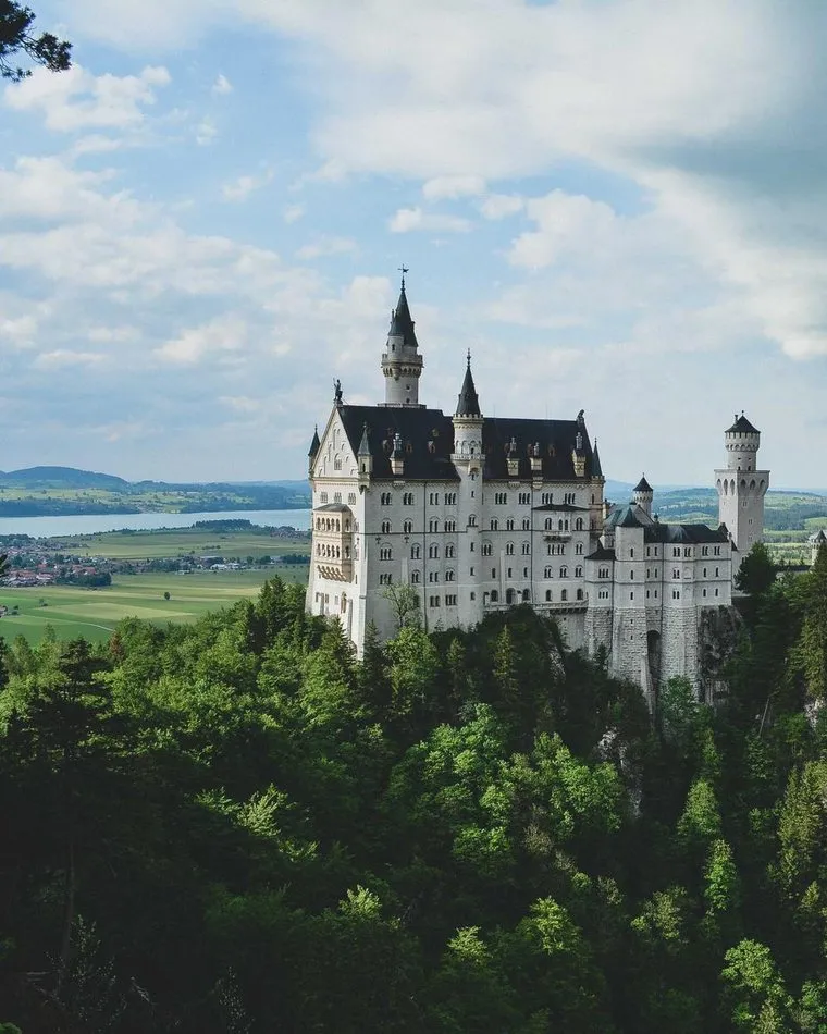
MDX of this sample
<HeroSplit
  title="Nordvind Station N3"
  highlight="Two-year battery, one bolt"
  description="Sensors come calibrated and swap in the field without tools. The housing survives the winter outdoors, and the radio reaches the gateway from four kilometres away."
  image="photo-tall-02.jpg"
  primaryText="See the models"
  primaryHref="/stations/"
  secondaryText="Datasheet"
  secondaryHref="/downloads/"
/>The season, recordedfrom the first frost to the last harvest
Everything the stations measure is stored from day one, so the season you are having can be compared with the season you had.
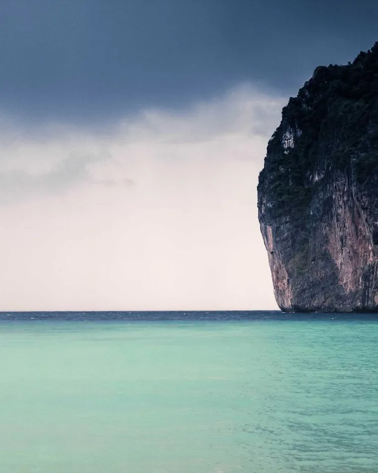
MDX of this sample
<HeroSplit
  theme="dark"
  imageFit="cover"
  imageSide="left"
  title="The season, recorded"
  highlight="from the first frost to the last harvest"
  description="Everything the stations measure is stored from day one, so the season you are having can be compared with the season you had."
  image="photo-tall-01.jpg"
  primaryText="Open the dashboard"
  primaryHref="/dashboard/"
/>
Props
| Name | Type | Required | Default | Description |
|---|---|---|---|---|
| title | string | yes | ||
| highlight | string | accent line rendered in the brand gradient under the title | ||
| description | string | |||
| image | string | yes | ||
| imageSide | 'left' | 'right' | 'right' | ||
| theme | 'light' | 'dark' | 'light' | ||
| imageFit | 'cover' | 'contain' | 'contain' | ||
| primaryText | string | |||
| primaryHref | string | '#' | ||
| secondaryText | string | |||
| secondaryHref | string | '#' |
Source apps/www/src/sections/HeroSplit.astro @ gitt.one
---
/**
 * HeroSplit — the first screen with the text on one side and the picture on
 * the other. `imageSide` puts the picture left or right; `theme="dark"` sets
 * the text on a stone band.
 *
 * imageFit="contain" shows the picture whole, hugging the section's bottom
 *                    edge — for product shots. Only a PORTRAIT picture looks
 *                    right here: a landscape one sinks into the bottom corner
 *                    and leaves the top of its half empty (Kirill, 2026-09-08).
 *                    For a landscape photo use imageFit="cover" or HeroCover.
 * imageFit="cover"   fills the picture half edge to edge behind a diagonal
 *                    that hands the band over to the photo.
 */
import { Image } from 'astro:assets';
import { resolveImage } from '../lib/images';
import Button from './_Button.astro';

interface Props {
  title: string;
  /** accent line rendered in the brand gradient under the title */
  highlight?: string;
  description?: string;
  image: string;
  imageSide?: 'left' | 'right';
  theme?: 'light' | 'dark';
  imageFit?: 'cover' | 'contain';
  primaryText?: string;
  primaryHref?: string;
  secondaryText?: string;
  secondaryHref?: string;
}
const {
  title, highlight, description, image: imageName, imageSide = 'right', theme = 'light',
  imageFit = 'contain', primaryText, primaryHref = '#', secondaryText, secondaryHref = '#',
} = Astro.props;
const image = await resolveImage(imageName);
const dark = theme === 'dark';
const bleed = imageFit === 'cover';
const left = imageSide === 'left';
---

<section class:list={['relative overflow-hidden', dark ? 'bg-stone-800 text-white' : 'bg-white text-gray-900']}>
  <div class:list={['mx-auto max-w-7xl', bleed ? 'lg:grid lg:grid-cols-2' : 'relative w-full px-4 pt-16 text-center sm:px-6 lg:px-8 lg:py-40 lg:text-left']}>
    <div class:list={[left && bleed && 'lg:order-2', !bleed && ['mx-auto max-w-[40rem] lg:w-[48%]', left ? 'lg:ml-auto lg:mr-0' : 'lg:mx-0'], bleed && ['px-4 py-16 sm:px-6 sm:py-24 lg:px-8', left ? 'lg:pl-16' : 'lg:pr-16']]}>
      <h1 class="text-4xl font-extrabold tracking-tight sm:text-5xl lg:text-6xl">
        {title}
        {highlight && <span class:list={['block bg-gradient-to-r bg-clip-text text-transparent', dark ? 'from-primary-300 to-primary-alt-400' : 'from-primary-500 to-primary-alt-600']}>{highlight}</span>}
      </h1>
      {description && <p class:list={['mt-6 text-xl', dark ? 'text-primary-100' : 'text-gray-500']}>{description}</p>}
      <slot />
      {(primaryText || secondaryText) && (
        <div class:list={['mt-10 flex flex-wrap gap-4', !bleed && 'justify-center lg:justify-start']}>
          {primaryText && <Button href={primaryHref}>{primaryText}</Button>}
          {secondaryText && <Button href={secondaryHref} kind="secondary" onDark={dark}>{secondaryText}</Button>}
        </div>
      )}
    </div>
    {!bleed && (
      /* the photo hugs the section's bottom edge, as it always did; it is
         positioned against the max-w-7xl shell, so it takes half of the
         container and not half of the viewport */
      <div class:list={['relative mt-8 h-64 w-full lg:absolute lg:inset-y-0 lg:mt-0 lg:h-full lg:w-1/2', left ? 'lg:left-0' : 'lg:right-0']}>
        <Image src={image} alt="" widths={[400, 840, 1280]} loading="eager" fetchpriority="high" class:list={['absolute inset-0 h-full w-full object-contain object-center', left ? 'lg:object-left-bottom' : 'lg:object-right-bottom']} />
      </div>
    )}
    {bleed && (
      <div class:list={['relative h-64 sm:h-80 lg:h-auto', left && 'lg:order-1']}>
        <Image src={image} alt="" widths={[400, 840, 1280]} loading="eager" fetchpriority="high" class="absolute inset-0 h-full w-full object-cover" />
        <svg class:list={['absolute inset-y-0 hidden h-full w-24 lg:block', dark ? 'text-stone-800' : 'text-white', left ? 'right-0 translate-x-px' : 'left-0 -translate-x-px']} viewBox="0 0 100 100" preserveAspectRatio="none" aria-hidden="true">
          <polygon points={left ? '100,0 100,100 0,100' : '0,0 100,0 0,100'} fill="currentColor" />
        </svg>
      </div>
    )}
  </div>
</section>
Source links point to engine-astro@38c294d9. Samples are demo content: the components are the real ones, the copy and the pictures are made up.